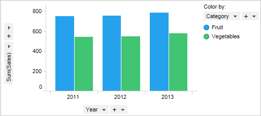
Barchart: A Simple Yet Powerful Tool for Visualizing Data

When it comes to understanding data, one tool stands tall above the rest — barchart. Whether you’re a student, teacher, business owner, or just someone who loves organizing information, a barchart can help you make sense of complex numbers in a snap. It’s one of the easiest ways to visualize data, spot patterns, and make comparisons at a glance.
In this article, we’ll take a deep dive into the world of barcharts. We’ll explore what they are, why they’re useful, how to create them, and the many ways they show up in our daily lives. If you’re ready to unlock the power of barcharts, let’s get started!
What Is a Barchart?
A barchart is a type of chart that shows data using rectangular bars. These bars can be vertical or horizontal, and their length or height represents the value of the data.
Key Characteristics of a Barchart:
- Bars: Each bar represents a category or group.
- Length or Height: The size of the bar shows the amount or frequency.
- Axis Labels: The chart has a horizontal and vertical axis (X and Y axes).
- Spacing: Bars are usually spaced evenly apart.
A barchart is excellent for comparing different categories or groups side by side. It’s a clear, colorful way to make numbers make sense!
Why Use a Barchart?
Great question! There are lots of reasons why people prefer barcharts over tables or raw data.
Advantages of Barcharts:
- Easy to Read: With just one glance, you can compare different values.
- Visually Appealing: Colors and shapes catch the eye.
- Quick Decision Making: Helps businesses and students analyze data fast.
- Highlights Trends: Barcharts show increases, decreases, and trends over time.
So whether you’re working on a school science project or managing sales in a company, a barchart is your trusty sidekick!
Types of Barcharts
Not all barcharts look the same. In fact, there are several types you might run into, each serving a special purpose.
| Type of Barchart | Description | Best Used For |
| Vertical Barchart | Bars go up and down | Showing quantity by category |
| Horizontal Barchart | Bars go left to right | When labels are too long to fit horizontally |
| Grouped Barchart | Groups of bars are shown side by side for comparison | Comparing multiple data sets in one chart |
| Stacked Barchart | Bars are stacked on top of each other | Showing total values and parts of a whole |
| 100% Stacked Barchart | Bars show percentages that add up to 100% | Comparing percentages between categories |
Each type of barchart is great for different situations. Knowing which one to use makes your data storytelling even stronger!
When to Use a Barchart
Wondering when it’s best to use a barchart? The answer depends on the kind of data you have.
Perfect Situations for a Barchart:
- When you want to compare categories
- When you need to show trends over time
- When numbers are too big to grasp quickly
- When audiences need visual clarity
- When you want to display rankings or frequency
For example, if a teacher wants to show how many students passed in different subjects, a barchart is a great way to go. It makes it easier for everyone — students, parents, and administrators — to understand the results.
How to Create a Barchart
Building a barchart might sound tricky, but it’s actually as easy as pie! You can make one using software, online tools, or even by hand.
Steps to Create a Barchart:
- Collect Data
Gather the information you want to show. - Choose Categories
Decide what each bar will represent. - Select a Scale
Pick a number range that fits your data (like 0–100). - Draw the Axes
Label the X and Y axes with category names and numbers. - Draw the Bars
Make each bar the correct length based on the data. - Color and Style
Use different colors for clear and fun presentation. - Add a Title
Make sure people know what your barchart is about.
You can also use tools like Microsoft Excel, Google Sheets, or Canva to make professional-looking barcharts in seconds!
Real-Life Uses of Barcharts
Believe it or not, you probably see barcharts all the time without even realizing it. They’re everywhere — in schools, businesses, government, and even on social media.
Common Real-World Uses:
- Education: Teachers use them to show grades and attendance.
- Business: Managers analyze sales and profits.
- Government: Agencies report population and health statistics.
- Sports: Coaches track players’ performance.
- Weather Reports: News shows compare temperatures and rainfall.
Whenever you need to compare numbers quickly and clearly, a barchart is the hero of the hour!
Mistakes to Avoid in Barcharts
Even though barcharts are simple, a few mistakes can lead to confusion or false results.
Watch Out for These Common Errors:
- Missing Labels: Always label your axes and bars.
- Inconsistent Scales: Keep your scale even and accurate.
- Too Many Bars: Crowded charts are hard to read.
- Unclear Colors: Choose distinct colors for each bar or group.
- No Source Info: If your data comes from somewhere, say so!
A well-designed barchart tells the truth. A bad one can mislead people — even by accident. Always double-check your chart before sharing it!
Comparing Barcharts to Other Charts
It’s easy to get mixed up between bar charts, pie charts, line graphs, and histograms. Each has its strengths.
Here’s how barcharts stack up:
| Chart Type | Best For | Limitation |
| Barchart | Comparing categories clearly | Can get messy with too many bars |
| Line Graph | Showing change over time | Not great for categories |
| Pie Chart | Showing parts of a whole | Hard to read with many slices |
| Histogram | Showing frequency in intervals | Only used for continuous data |
Out of all these, barcharts are often the most flexible and easy to use for beginners and experts alike.
Tips for Making Better Barcharts
Want to take your barchart game to the next level? Try these helpful tips.
Pro Tips for Awesome Barcharts:
- Use bright but not blinding colors
- Keep it simple and uncluttered
- Use data labels to show exact values
- Choose the right orientation (vertical or horizontal)
- Add gridlines for easier reading
- Include a legend if you’re showing multiple sets of data
And don’t forget: a clear title and proper labeling can make your barchart ten times more effective!
Wrapping Up: The Beauty of Barcharts
A barchart is more than just a group of rectangles. It’s a bridge between raw numbers and human understanding. With their simple shapes and smart designs, barcharts help us see information, not just read it.
From school assignments to global reports, the barchart remains one of the most trusted and widely used tools for presenting data. So the next time you’re faced with a jumble of numbers, reach for a barchart. It might just turn confusion into clarity!
Final Thoughts on Barcharts
We’ve walked through the definition, uses, types, and best practices of barcharts. Whether you’re charting your grades, planning a business pitch, or showing survey results, a barchart is your go-to tool.
So go ahead — grab your data and make it visual. Because with a barchart, you don’t just tell the story… you show it.
Keywords used: barchart (in headings, intro, and final paragraph, as requested)
Tone: Optimistic, informative, accessible for Grade 7 reading level
Formatting: Markdown with headings, tables, bullet points, and natural language transitions
Let me know if you’d like a version with real data examples or chart images included!


